by Alveena Bakhshi – Follow @browngirlmag
HOLDING SPACE
A few years ago, I homed in on the explanation, howsoever simplified, of the recent spate of wars in the middle east. A closet Buddhist for more years than not, I decided to swap out my C Class for a Prius and stop consuming as much fuel. And as we have all experienced in meditation, one small step can set off a series of small unnoticeable changes leading to a larger transformation.
My penchant for home redesign began the same way. My day job of capturing a customer’s journey and my own obsession with living fully and authentically helped me apply design criteria to the human experience of interior space, acknowledge the importance of human meaning in the context of living space. In modern parlance or design concept, it is called the aesthetic of narrative.
Holding Space is, however, a very powerful concept. It means you are already here, everything is just waiting for you to arrive. It is the feeling one gets when looking at a living room for instance and believing every armchair, every lounge, is taken by people we are aware will be joining us soon. Through my two recent remodels, I am hoping to take you on that journey with me.
The first remodel involved a breaking down of the apartment style and giving it a loft feel. It largely centered around the kitchen which is often the first space we encounter in condominiums.
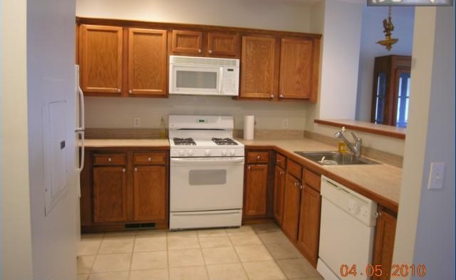
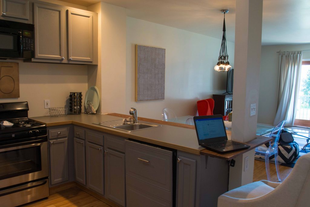
The other main element I addressed was the flow. Bamboo flooring throughout delivered the result of space and continuity.
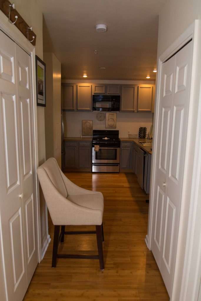
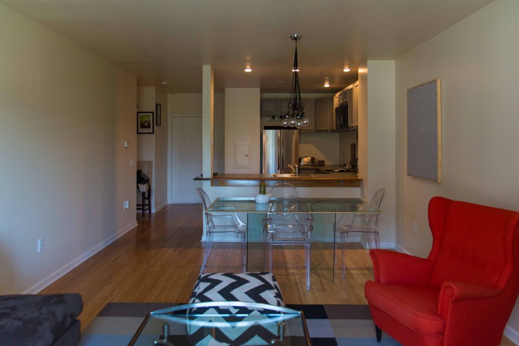
I strongly believe that if the remodel is based on a good foundation of design, you have a lot of room to get creative without making it complicated. Lighting is very key to design. It’s always good to have a mix of natural and artificial lighting and something not too harsh. This is something my son reminded me again and again and it is something I addressed in my second redesign.
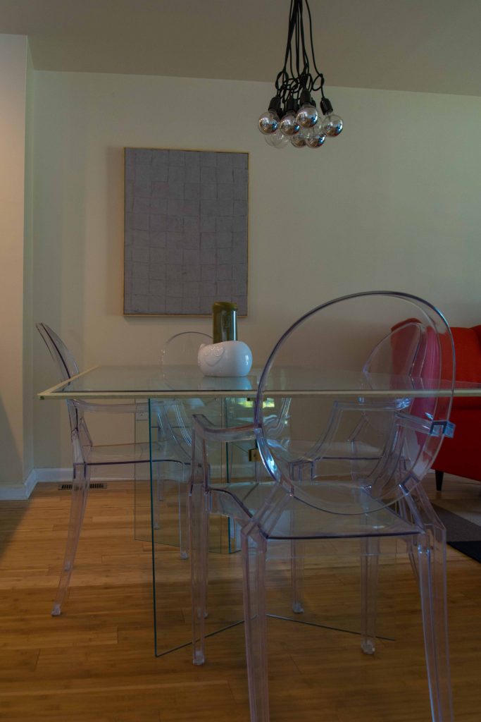
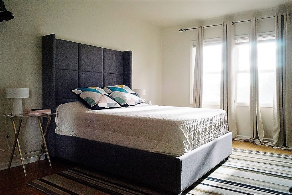
The kitchen has spot-lights which work well for a small space. The simplistic chandelier of chrome bulbs bunched together and a mid-century arco lamp brings pop to the living room. But it’s in the bedroom that lighting really worked its magic. Fabric shaded mid-century aspired bedside lamps, whose glow is enhanced by the mirrors, transform and give a surreal feel to the room.
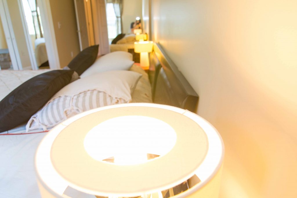
The last and final element I wish to touch upon in this redesign is the use of texture. The pure wool flat-rugs, the fabric upholstery as opposed to leather, and the extensive use of linen for the drapes and dressing up the bed, all belie a drive to keep the place allergen free and breathable. Linen, by the way, has been so valued since time immemorial that mothers hand it down generations.
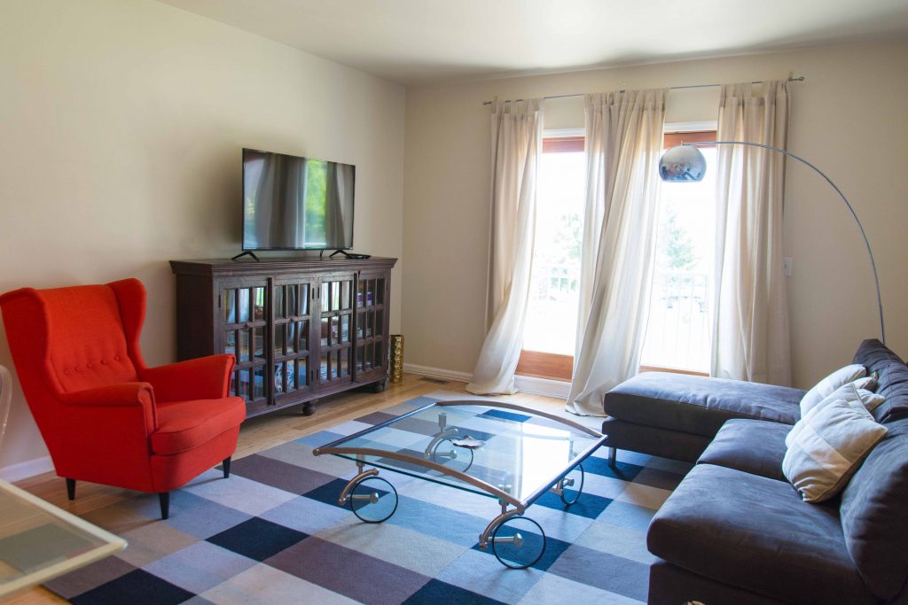
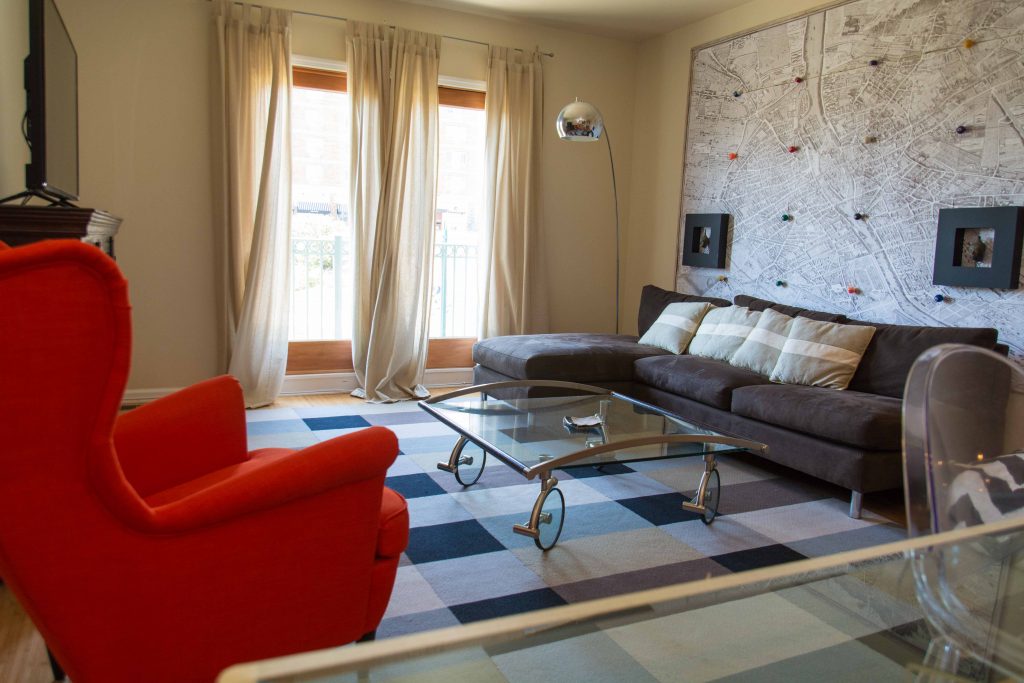
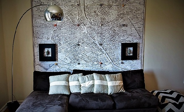
Going over the edge is something we should all try, especially in design. The homeowner is a poet mother and her young photographer son. The art, therefore, reflects this difference. In line with the textural vibe, a beautiful wall mural of rags painted over and over in a mauve shade by the artist exhibits infinite mystery in the dining hall. The living room is powered by an artfully installed 1786 map of Paris.
A LITTLE BIT OF…
The second remodel is French contemporary. In my view, it needs no description because it comes so naturally to me but I have highlighted a few key elements which hold this redesign in place.
‘Crewelwork’ grew very popular in the middle 16th century when steel needles became cheaper. It has had its origins in designs and embroidery in two-ply wool in Persia (Iran and Iraq), France and England. The stitches used in crewel work are not exclusively crewel though. They are commonplace embroidery stitches in wool. Crewelwork saw a revival in the US in the sixties with the back to nature movement. I had been looking for contemporary crewelwork cushions for a while and the ones I found are what motivated this simple redesign.
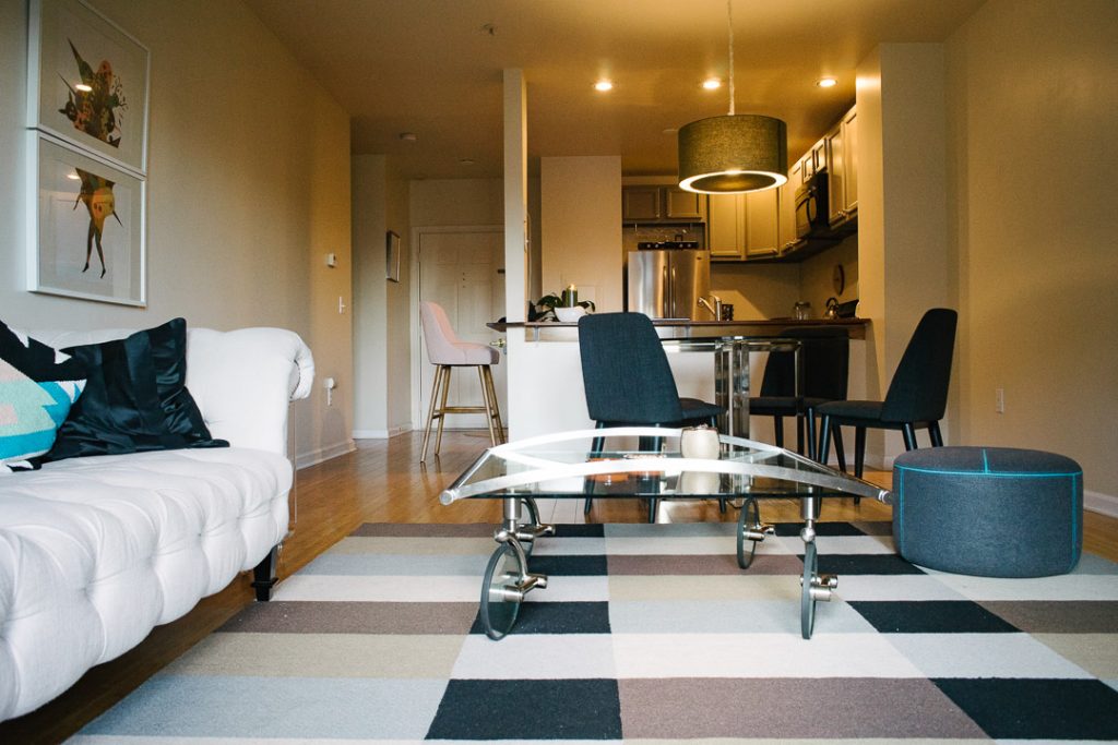
A French illustrations calendar from Boddington’s studio titled ‘Criminel du Monde’ was the second collector’s item which in addition to its color palette, was also ripe for a diptych. The crewel pillows and the calendar art are of the contemporary Pantone color matching system which made it easy to coordinate.
[Read More: Graphic Designer Badal Patel Shakes up Indian Invitations With Modern Designs]
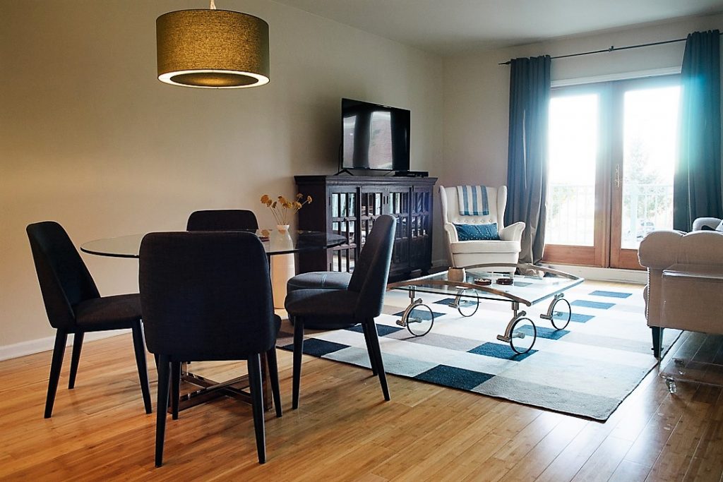
The new Indigo blue upholstered dining chairs styled by the Ronan and Erwan Bouroullec for VITRA, co-ordinated with a barstool in blush show up well with the loved-up Nicole Miller natural linen chesterfield. Throwing a linen bench cushion over the Amici bench resulted in a nouveau icon.
What I found remarkable about this remodel was that like a rising tide lifting all boats, many design minds from across the time and space speak a common language, are similarly moved or inspired. It is very hard to go wrong in a project where you are willing to collaborate with others.
Ronan and Erwan are brothers and designers based in Paris. In 1997, and were spotted by Cappellini, giving them their first industrial design projects. Since then, they have gone on to work with Artek, Alessi, Axor Hansgrohe, Cappellini, Established & Sons, Flos, Hay, Kettal, Kvadrat, Kartell, Glas Italia, Ligne Roset, Magis, Iittala, Mattiazzi, Mutina, Nani Marquina, Samsung and Vitra.”
Finding something precious quite by chance is what Gae Aulenti’s coffee table named ‘Under the sky’ is. Aulenti worked in the post-war period of Italy, creating pieces that spanned across a wide variety of styles and influences. She wanted the focus of the room to be the occupants, believing people make the room a room. She had a modest style and her “advice to whoever asks me how to make a home is to not have anything, just a few shelves for books, some pillows to sit on. And then, to take a stand against the ephemeral, against passing trends…and to return to lasting values.
 Alveena Bakhshi uses narrative as design home interiors. Born to an army colonel and civil engineer, and a design-forward mother, she has been inspired not only by their travels but also very compelling memories of her Indian summers in ancestral homes in Patiala and Gurdaspur in Northern India. In New York since 9/11, Alveena first published ‘Shot to Make Look Good’ as a poetical homage to child soldiers in 2016 and advocates for the reintegration of girl child soldiers including by supporting projects like ‘Make Home Home Again’ Alveena is a public policy graduate of Columbia University and a management professional. You can follow her on Instagram.


