There are more than a few typefaces out there. Actually, there are more than a few thousand typefaces out there. With each passing year as well as developing trends in both technology and creative media, there are new fonts created all the time.
There is a thinking in a culture that new is better, but that is not necessarily the case. There are certainly a number of different fonts from past generations that have more than maintained their popularity throughout the years. This is because once something goes into style, it can hold popularity with that generation and then make a comeback later on down the line.
This is no different with fonts. There are many fonts that were created centuries ago without nowadays software, but now you can easily download Typewriter fonts, that remain just as popular now as they ever have. Knowing which of those fonts remains as popular as ever to designers can be helpful if you are an aspiring designer. Here are five of the most popular classic fonts out there.
Futura

Futura was originally designed and released in 1927 by Paul Renner and is considered to be the grandfather of what is known as “geometric sans-serifs”. That is, it follows a wave of re-brands that have become minimalist in nature from the likes of Mastercard Google and Spotify in the last decade.
Futura is actually used by a huge amount of well-known brands. These include Gillette, Alfa Romeo, Domino’s Pizza, Cisco, and so many more. Despite nearing the century mark in regards to its age, it remains an iconic typeface in its popularity and does not show any signs of waning.
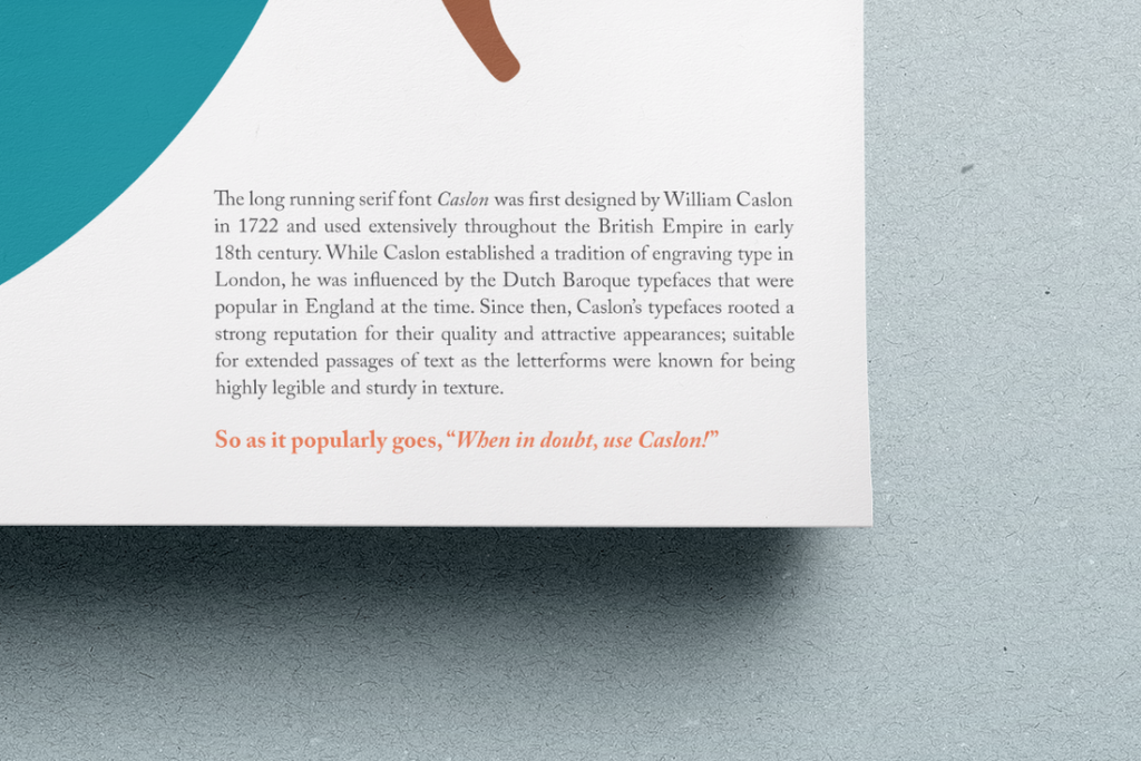
Caslon

As old as Futura may seem, it has nothing on the font that was created by William Caslon, an engraver of punches, which are master templates that are used to create molds used in metal type — that lived all the way back fro 1962-1766.It has effortless readability on larger passes of text as well as a timeless elegance that cannot be matched. After falling out of popularity in the early 19th century, it has since recovered and become one of the most popular fonts available today. It is most commonly used for journal articles, books, encyclopedias, and so much more.
Garamond
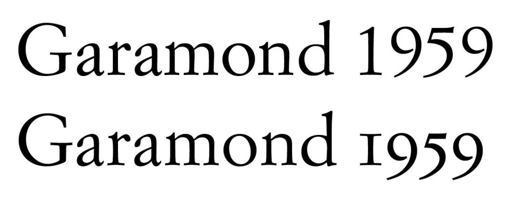
Yet another font typeface that is popular for large passes in textbooks, its heritage has made it as popular as the three-century-old Caslon. It, like Caslon, is named after it’s the creator: Claude Garamond. He also created the same metal punches for type and created this font type all the way back in the 16th century.
There have been many modern revivals of the typeface and have seen a resurgence in the French typography scene. It is versatile but creates the kind of classic design that many designers have found themselves drawn to in recent years.
Clarendon

With slab serifs having found popularity in British lettering, signage, and printing during the early part of the 19th century, Clarendon has been riding a wave of popularity since its release all the way back in 1845. It was designed by, you guessed it, a punch-cutter named Benjamin Fox but has been credited to a man named Robert Besley, a partner at the foundry Thorowgood and Co.
It has a look that was widely imitated in the 20th century and has spawned a sub-genre of type designs of its own right. There are definitely many different types of Clarendon, but there are common factors: solid, bold letterforms that have a somewhat similar stroke weight as well as that bracketed, tapered slab serif look.
Akzidenz Grotesk
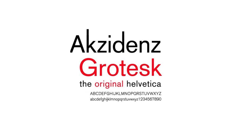
We all know Helvetica is one of the defining typefaces for an entire generation of designers in the mid-20th century. These designers adopted a number of Swiss design principles that have come to be known as the International Typographic Style.
But the fact is that Helvetica follows in the footsteps of Akzidenz Grotesk which was released back in 1898. It helped to pioneer a wave of “overtly commercial” brands of typefaces but has remained popular through the widespread use of Helvetica.
As you can see, there are a few fonts that have been around for centuries yet maintain their level of popularity through readability and a sense of history for designers of all ages and generations. These typefaces will likely persist throughout time.


